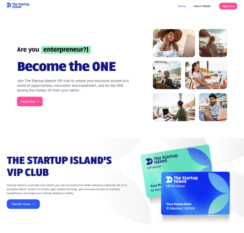
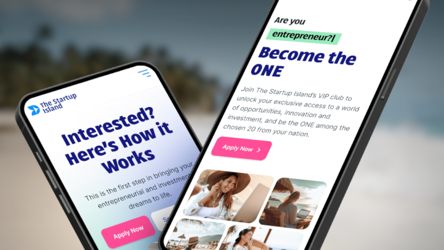
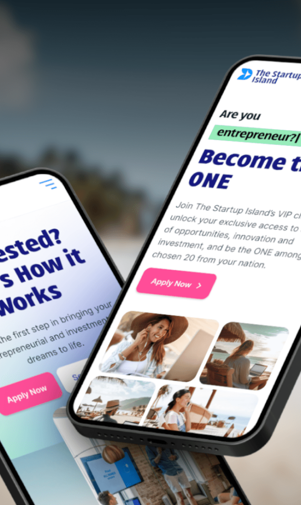
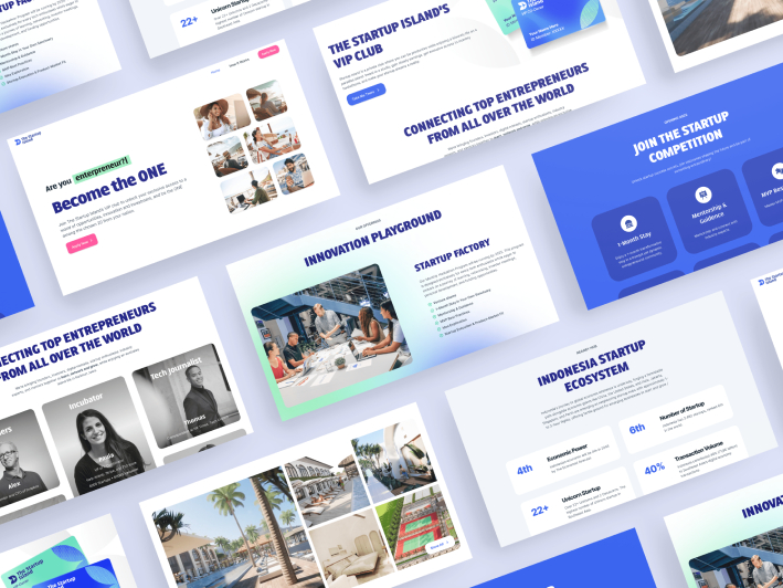
How we help TSI create a delightful user experience for startup enthusiasts to work productively while living in Paradise.
The Startup Island, nestled in the laid-back setting of Karimun Jawa, Indonesia, had a unique vision. Rather than merely focusing on real estate sales, they aspired to create a hub for digital nomads and startup enthusiasts—a place for learning, networking, and personal growth. The challenge was substantial: to transform this bold idea into a thriving digital ecosystem.
For three intensive months, Webfeeling’s team diligently worked on this project. This case study will take you through our process, from initial concept to website launch, demonstrating how Webfeeling turned a unique idea into a digital community.
The target audience of the website is tech startup enthusiast who is looking to be productive while maintain work-life balance. In this case study we helped startup enthusiast to grow, network and secure good investment.
The path to success is not always smooth for aspiring startup enthusiasts. In this section, The Startup Island identifies four key challenges they commonly encounter.
Lack the knowledge necessary for startup success.
Building connections with like-minded individuals and potential investors for their project.
Many of them do not know if there is a secured investment made exclusively in the digital ecosystem.
Striving to strike a balance between professional aspirations and personal lives poses a considerable challenge for many.
Create an environment that encourages personal development while simultaneously building a dynamic network of startup enthusiasts.
Simplifying the path to invest in a startup ecosystem.
Live productively while enjoying life in paradise.
What’s the goal of the project?
To create a hub for connecting and networking with fellow startup enthusiasts, participating in a program to learn deeply how to build and sustain a digital business, and, most importantly, attracting potential investors for their projects.
Got it. We’re here to help you...
Convo with client
By addressing user needs, make some adjustments and refining the business model, we aim to craft a digital experience made for tech enthusiasts. This is how it goes…
To understand our audience better, we’ve created five different characters that represents a different type of person who might be interested in The Startup Island.
Goals
Networking, skill enhancement, and exposure to mentors.
Challenges
Need for mentorship and lack of network.
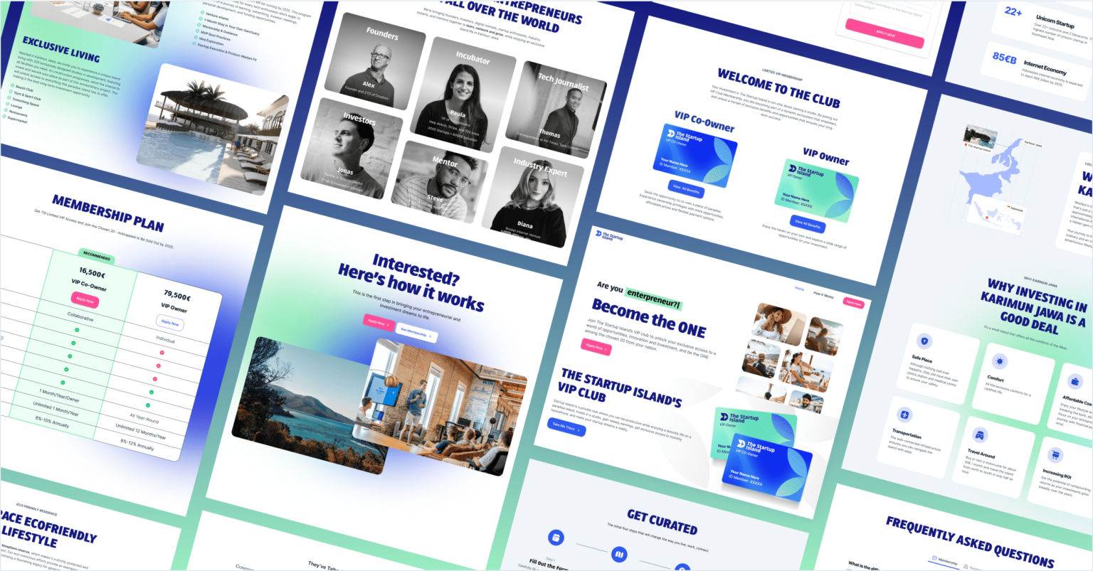
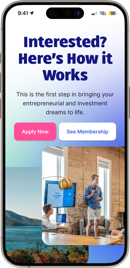
Goals
Network with founders and investors and explore investment opportunities.
Challenges
Balanced time for networking & evaluating project viability.
Goals
Attract diverse participants and Successful hackathons.
Challenges
Balance diverse needs and measure event impact.
Goals
Cover innovative projects, success stories, and emerging tech trends.
Challenges
Finding stories for readers and accuracy and in-depth reporting.
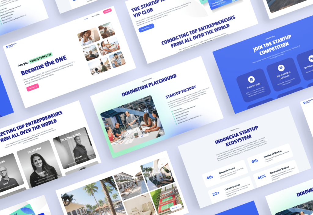
To create a stand out website, we needed to understand what other similar projects were doing, so we conducted a competitive analysis to gain valuable insights.
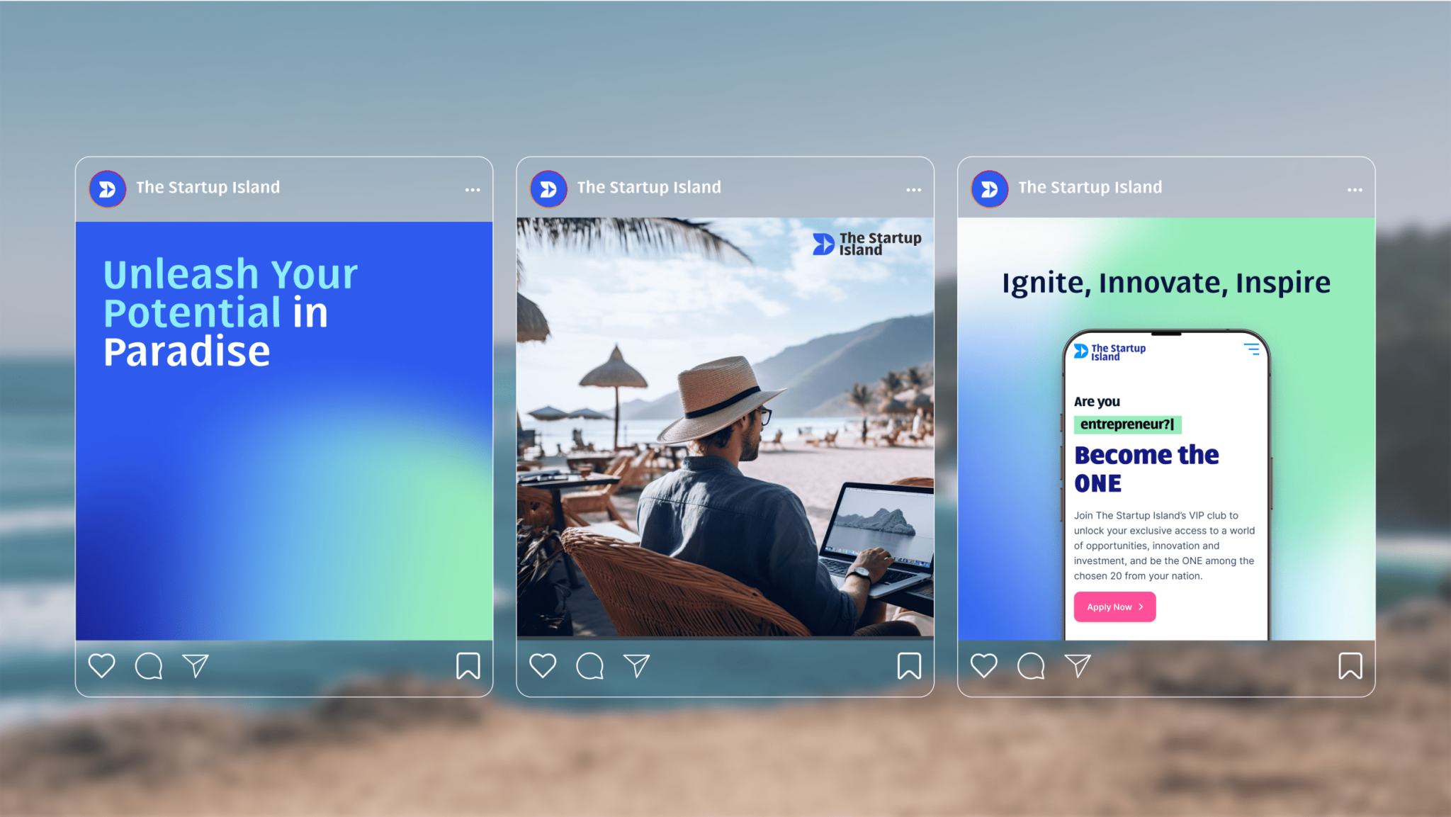
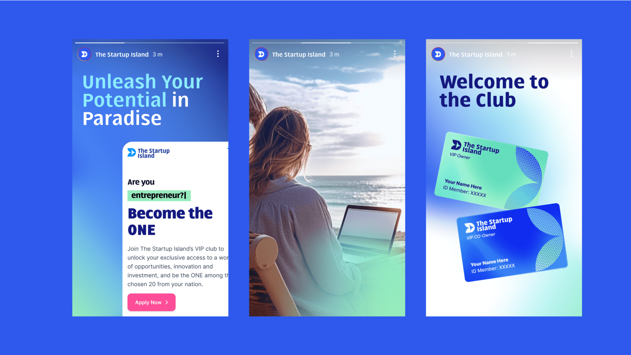
“Great storytelling: brand, events, and process are well communicated”
“Modern site, clean layout, many event pics boost credibility”
“The site gains trust due to a well-established partner network.”
“Strong credentials, through 7 years of well-documented program”
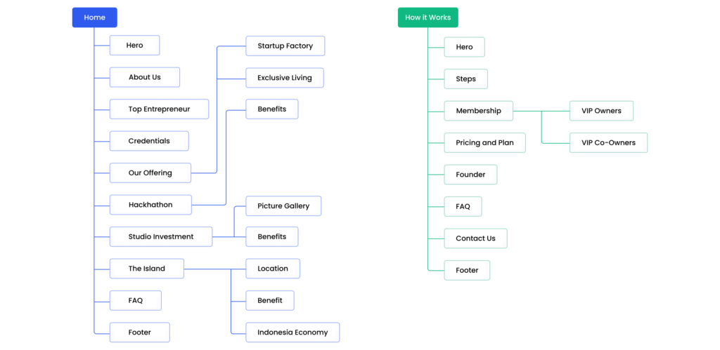
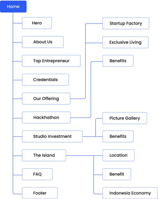
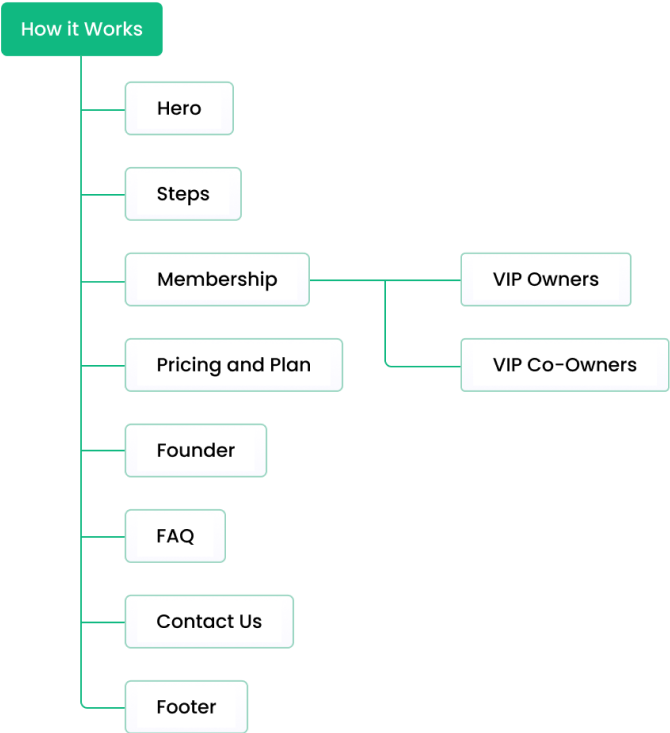
“Clear and organized information architecture. Intuitive & user-friendly”
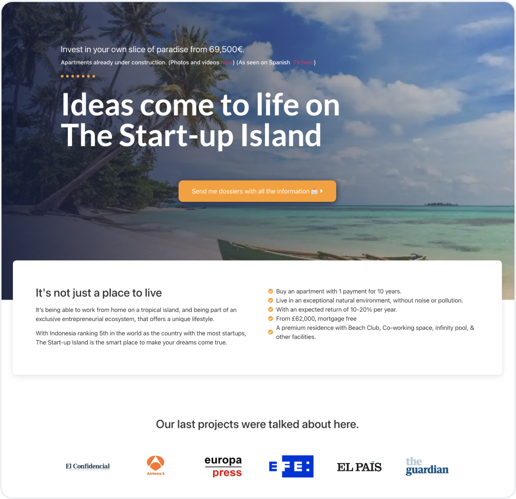
We rebranded The Startup Island as a dynamic destination for living, learning, and enjoying life, crafting an identity that mirrors the excitement of the startup world and its constant evolution.
During the process, we conducted a content analysis to establish the tone of language to connect with our modern, tech-savvy readers.
We use tech-savy language to resonate with tech enthusiasts and millennials.
Our target audience comes from around the world, so we chose to use simple English for direct and easy communication with non-native speakers.
Convey the exclusivity of being a part of the club with like-minded individuals the island and the excitement of joining a thriving startup ecosystem.
Keep the tone friendly and approachable, making readers feel they are part of a community.
Our goal is to organize content effectively to ensure visitors find what they need. These visuals outline our planning and organization, in providing a clear roadmap.
In this phase, We create the website’s structure, focusing on layout and content placement, then refining it iteratively to meet user needs and expectations.
This section emphasizes aesthetics, interactions, and micro-interactions to enhance the user experience while maintaining a consistent and appealing brand image.
Our hero section opens with a bold statement: “Only 20 people will get this chance.” This grabs the visitor’s attention, emphasizing the exclusivity of the opportunity to being selected.
We also added a dynamic headline with motion effect on the hero copy, making it not just a message but an experience. This eye-catching addition ensures that our users are not only informed but also engaged from the very first moment they land on the site.
Since the business model changed from the previous website, we innovated a solution that combines all the features and offerings into two distinct memberships.
To ensure our users can easily understand the distinctions between VIP Co-owner and VIP Owner membership, we’ve employed a table view format. This format helps users to easily compare features from both options and guides them to a better decission.
One essential aspects of this design is making sure that VIP Co-owner benefits are shown in a prominent position. This strategic layout enhances user comprehension, empowering them to choose the membership that best suits their needs.
The Startup Island aspires to become a prominent global hackathon hub. This isn’t just about providing an exciting experience for startup enthusiasts; it’s also a fantastic opportunity for investors. Thus, we created 3 sections to communicate the benefits of being a part of this growing ecosystem.
Our team also thoughtfully integrated comprehensive information about the captivating island of Karimun Jawa and insights on Indonesia’s digital economic position. These sections provide users with a well-rounded understanding of Karimun Jawa and Indonesia, from its geographical advantages to the wealth of investment opportunities it offers. It allows them to make informed decisions regarding travel, investments, and business prospects on the island.
Throughout the website, including on the contact form, a key strategy has been to maintain a persistent focus on the benefits of The Startup Island’s offerings. This approach is designed to continuously remind users of the unique advantages they can access as the member of the club.
The inclusion of a sticky WhatsApp icon at the bottom of the website streamlines user access to the TSI team, fostering convenient and immediate communication for inquiries, enhancing the user experience.
To seamlessly adapt from the website version, we tailored the layout without any changes to the design to accommodate various mobile screens, both large and small.
We adapted the mobile version’s navigation bar with a hamburger menu (on the left side) to make it simple and optimize user-friendliness for mobile devices.
We’ve added two sticky CTA buttons on the mobile version for user-friendly navigation and easy access to important actions (to apply or to contact The Startup Island directly on Whatsapp).
Our website depends on this table to offer crucial membership details, such as pricing and benefits, so we optimized it for mobile devices, complete with a tapable tooltip.
In the section where we showcase influential figures in the tech industry, we’ve adapted it to a carousel image view, allowing users to swipe through the photos.
This adaptability provides a user-friendly experience, with content optimized for each screen size and orientation for ease and satisfaction even when the screen is rotated.
In responsive design, we’ve adjusted the layout to be vertical for easy readability. This approach is applied to several sections, including the hackathon benefits and the VIP club memberships.
With the implementation of Adaptive and Responsive design, we are able to facilitate users in accessing the relevant information with ease.
Through UX principles and user-centric design, we allow users to quickly scan the offerings simply by looking at the interface.
Minimalist design philosophy elevates content readability while emphasizing what truly matters for our tech-savvy audience.
Efficiency helps users access the information they need quickly and perform tasks seamlessly.
We've ensured that all visual elements and the tone throughout the platform maintain a harmonious and consistent presence.
We've crafted an interface that's intuitive and easy to grasp, minimizing the learning curve for users for easy navigation.
With every aspect meticulously crafted on the platform, we foster positive interactions and keep users engaged.
Throughout the project, our team demonstrated a great dedication to delivering a website that encapsulates TSI’s vision by adjusting and developing the business model through user-centric decision-making.
By doing some improvements, emphasizing benefits through compelling storytelling, and implementing user experience elements, we are able to captivate TSI’s target audience – the tech enthusiasts and millennial investors.
Webfeeling understood my brief, customer base and goals better than any other design studio. They explained their design process and kept me informed every step of the way. I love how the entire process was managed, and the final work delivered exceeded my expectations.