Read with Ease: A Guide to Typography Brilliance in Web and Mobile Design

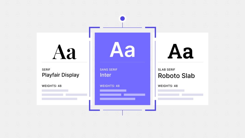
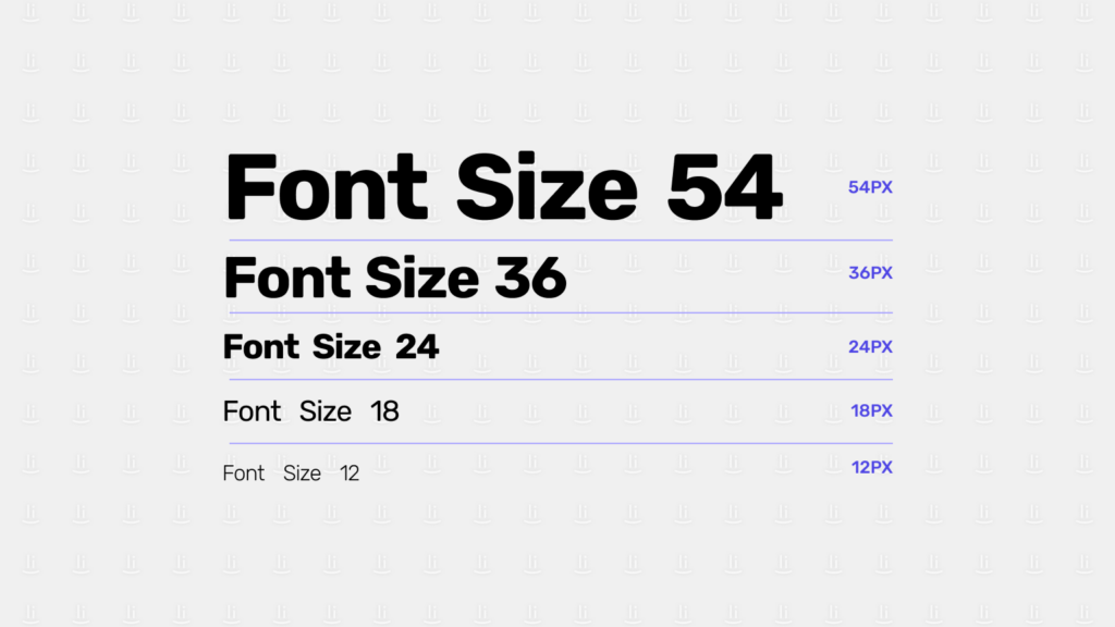
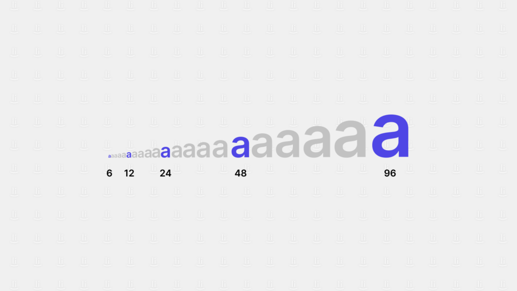
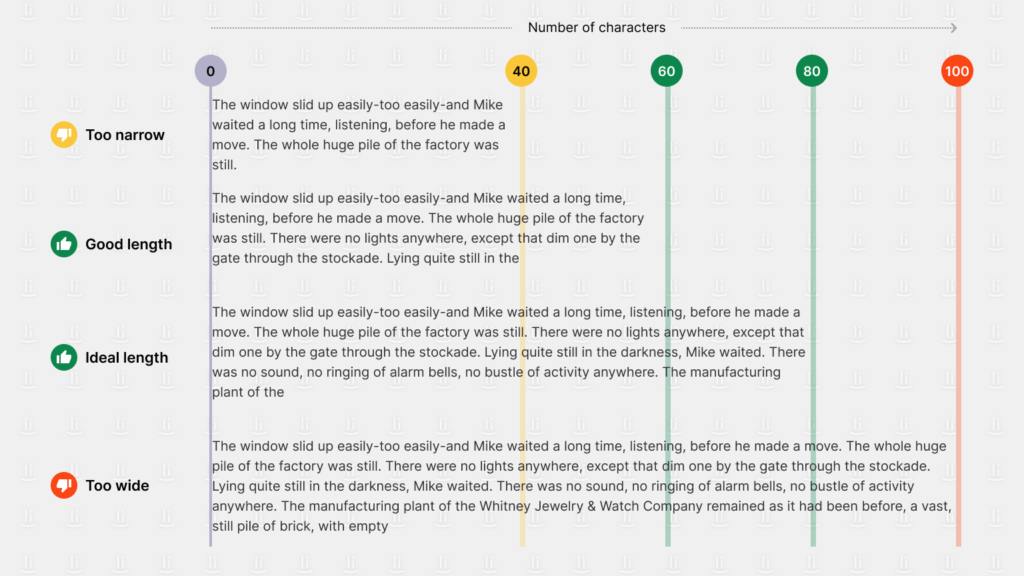
Typography is one of the essential elements in the world of design, as it encompasses the style, arrangement, and appearance of text. The right typography can evoke emotions and convey the tone of a message. In digital design, typography can also impact the readability and accessibility of a website or application. It may make it easier or harder for users to engage with the content.

Developing an effective typography that stands out and engages users can pose a challenge. However, by following these four best practices, you can create a typography that effectively captures your users’ attention.

Font Choice

Image: Font selection impacts readability and brand personality.

Approximately 80% of websites’ body text is typically dominated by core web fonts such as Arial, Georgia, and Verdana, as highlighted in Smashing Magazine’s article on Typographic Design Patterns and Best Practices.

Choosing the right font is important for both readability and aligning with a brand’s personality. However, it’s also good to experiment with alternative fonts. By selecting fonts that are consistent with a brand’s identity, companies can create a more cohesive and impactful visual representation of their brand.

  • Select and experiment with alternative fonts that resonate with the brand’s identity.
  • It is preferable to use just one typo.
  • Only select up to two types of fonts. If you want to use two, choose one for the heading and the other for the text.
  • Serif fonts work better for headings accompanied by serif fonts for text.
  • Select fonts that contradict the established brand personality and solely rely on core web fonts.
Interested in exploring different fonts? Check out some of there free online tools:

Font Size

Font size directly affects readability, especially on smaller screens.
  • Headlines
    When creating headlines, the size of the font to use depends on the specific font chosen. The most commonly used font sizes range from 18 to 29 pixels, with 18-20 and 24-26 pixels being the most preferred. The effectiveness of the headline font size is largely determined by how well it fits with the overall design of the website. If you have larger display sizes and resolutions, testing larger font sizes could be beneficial.
  • Body Copy
    Design trends now favour larger body copy font sizes, typically 12 to 14 pixels. The average font size for body copy is now 13 pixels, emphasising readability and attention to small typographic details such as dashes, quotes, and footnotes. However, exact sizes may vary depending on the target audience and typeface.

    Choosing the right font size for the body copy also depends on who our target audience is. For instance, if the target is the senior audience, we need to choose the text size generously, with extra leading to increase readability.
  • Ratio
    When choosing font sizes for your text, you can use a ratio of 1.96 between the body and heading font sizes as a starting point. This means that for every font size you choose for the body text, you can double that value to get the font size for your headings. However, remember that personal preferences and design styles may vary, so you can also consider other options, like traditional scales or natural typographic sequences like the Fibonacci sequence, to find the best fit for your design needs.
You can use the Fibonacci sequence to find the best fit for your design needs.

Line Length

The length of a text can help achieve optimal readability and aesthetic appeal.

Still, according to Smashing Magazine, every line of text should have about 1.5 times more space between the lines than the size of the text itself. If the text size is 10, having around 15 space units between the lines is excellent.

One interesting formatting detail is the space between paragraphs. Typically, there should be about 75% of the space between lines within a paragraph. This means that there should be a little extra space after a paragraph ends, but not too much to avoid making the document look unbalanced.

  • Aim for a moderate line length, typically around 50-75 characters per line, including spaces.
  • Use long lines that can strain the reader’s eyes and make it challenging to maintain focus while reading.

Background

The perfect backdrop works harmoniously with your font choices, enhancing readability and setting the right tone for your users.

  • Light on Dark
    Classic, elegant, dark backgrounds like navy or charcoal can make light-coloured text pop, ideal for minimalist designs or apps showcasing bold visuals. Ensure sufficient contrast for optimal readability (WCAG guidelines recommend a 4.5:1 ratio).
  • Dark on Light
    Airy and approachable, light backgrounds like white or soft grey provide excellent readability for text-heavy sites or apps. Use darker, bolder fonts for headings and essential elements to avoid a washed-out look.
  • Playful Pairings
    Vibrant backgrounds like tangerine or mint green can complement playful, casual fonts like Comic Sans or Bubblegum Script, perfect for children’s apps or informal blogs.
  • Sophisticated Symphony
    Muted backgrounds like sage green or dusty rose can elevate elegant fonts like Garamond or Bodoni, ideal for luxury brands or professional websites.
  • Image-Centric Canvas
    If your website or app relies heavily on visuals, opt for a neutral background like grey and beige to let the images take centre stage. Avoid competing with solid colours that might clash with your photography.
  • Text-Heavy Harmony
    For content-driven platforms, choose a background that complements the tone and message. A calming blue can enhance informative articles, while a warm yellow might suit a recipe blog.

Implementing these strategies makes your content accessible and enjoyable for users across diverse devices and preferences.

  • Ensure sufficient contrast between text and background colours to enhance readability, especially for visually impaired users.
  • Use busy or textured backgrounds that might clash with or distract from the text.
To help you choose the right colour combinations, these websites and apps can be helpful:

Five Tips to Consider

  • Background Contrast
    Ensure sufficient contrast between the background colour and text to make reading easier.
  • Paragraph Alignment
    Align paragraphs consistently for a clean and organised appearance. Left-aligned text is the most common and tends to be easier to read. Avoid justified alignment because it makes variant gaps between letters and is challenging to read.
  • Row Breaks for Visual Separation
    Use space between paragraphs or sections (row breaks) to separate content visually. Ample space between paragraphs gives readers a breather and helps them distinguish between different sections or ideas.
  • Consistency in Spacing
    Maintain consistent spacing between elements, paragraphs, and headers throughout your content. Inconsistent spacing can disrupt the flow and make it harder for readers to follow.
  • Utilise Bullet Points or Lists:
    When there are more than three points, using a bullet list is better than putting them in a row, as a few tiny dots attract the eye and can make a complex concept understandable. This helps break down information into digestible chunks, improving readability and comprehension. To help you presenting bulleted lists this article from Nielsen Norman Group can be helpful.

It is important to understand that typography is not solely about selecting the appropriate font. It also involves adjusting the spacing, line, and height. All of these aspects are crucial, and by paying attention to these details, you can ensure that your typography is both functional and aesthetically pleasing, leaving a lasting impression on the reader’s mind.

Resources:

Share this post

URL copied!
Monica Halim
UX Copywriter, Webfeeling

Don't want to miss anything?

Join our mailing list for design insights, case studies and tips directly in your mailbox.

Success!

Your email has been submitted successfully. Get ready for exclusive content delivered to your inbox!

Related posts

Understanding UI Design Patterns and Why They Matter

Ever wondered how your favourite apps and websites manage to provide a consistent and user-friendly experience? The secret lies in the artful application of UI (User Interface).

How Personas Fail: Updating Personas for Targeted Success

Using the same personas for years may impact usability and result in failure to deliver a user-centric product. In this article, we will explore why personas fail, the importance of updating them regularly, and best practices for keeping them relevant.

Ageless Accessibility: Designing User-First Experiences for Seniors

While technology is commonly associated with the younger generations, it's easy to forget that our senior citizens are also using and adapting to tech.

How Drag-and-Drop Globally Transformed User Interactions

Drag-and-drop functionality is a simple feature that has changed how we interact with computers and become a part of our digital experiences. The story of how it was created and became so popular is interesting and shows how it made using computers easier for everyone.
Hello 👋🏻

How can I help you with your project?

Enrique Medina

Typically replies in a few minutes.

Prompt response: 9:00 – 17:00 (UTC +8)