Feel the thrill in every click

Blog

Maximize Your Sales with Persuasive Design: Embracing the Picture Superiority Effect

Studying human behaviour is fascinating, isn't it?

As designers, studying human behaviour can help us identify which words or pictures get the desired response from users. This insight can enhance our ability to create compelling designs that resonate more deeply with the audience.

One powerful principle in design is the Picture Superiority Effect (PSE), which shows why images often communicate more effectively than words. This article will explore the PSE in detail and learn how to use it to improve your designs and increase conversions.

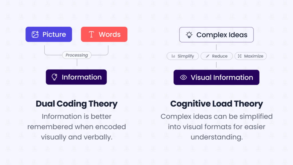
Understanding the Picture Superiority Effect

The Picture Superiority Effect (PSE) is a psychological principle that explains how images are more likely to be remembered and recognized than words. This occurs because the human brain processes visual information more efficiently and effectively than textual information. When we see an image, our brains can quickly comprehend and retain the visual details, making it easier to recall later.

Image: The human brain takes only 13 milliseconds to process an image.

In the context of UX design, leveraging the PSE means using images strategically to enhance communication, make messages more memorable, and ultimately drive better engagement and conversions.

Picture Superiority Effect & UX Design

In UX design, the picture-superiority effect is closely tied to several cognitive principles, such as:

  • Dual Coding Theory:

    This theory suggests that information is better remembered when it is encoded both visually and verbally. By using images alongside text, designers can enhance users’ memory retention and recall.
  • Cognitive Load Theory:

    Visuals can reduce cognitive load by simplifying information processing. Complex ideas can be broken down into more digestible visual formats, making it easier for users to understand and remember the content.
Image: Dual Coding Theory VS Cognitive Load Theory

According to the article from Nielsen Norman Group, the strength of the picture-superiority effect depends on some factors such as:

  • Discoverability:

    For a visual to be memorable, people must first discover and look at it. The longer someone views an image, the more likely they will remember it.
  • Clarity:

    The memorability of a visual is influenced by its clarity and concreteness. Literal and concrete visuals are easier for the mind to interpret and assign meaning than abstract ones.
  • Familiarity:

    The article highlights that familiarity with a concept or object enhances the memorability of its visual representation. People with more experience with a concept can better comprehend visuals related to it and associate words with those visuals.
  • Uniqueness:

    The uniqueness of a visual relative to others present influences its memorability. This uniqueness factor can play a significant role in capturing and retaining users’ attention.

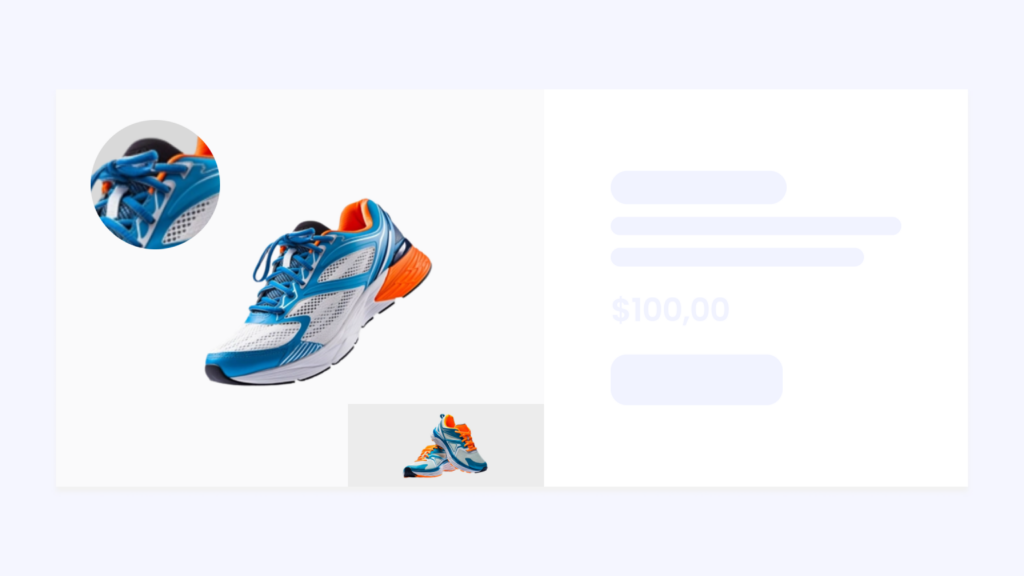
Implementing the Picture Superiority Effect can help companies increase their sales.

To see how this principle can help create a design that sells, let’s explore some practical examples of implementing the PSE in web design to create visually compelling interfaces that engage users and effectively communicate the value of your products or services.

  1. Use high-resolution, professionally photographed images to showcase your products.
    Provide multiple angles and close-up views to allow customers to examine the details. This helps create a visual connection with the product, increasing the likelihood of a purchase.

Image: Use high-resolution, professionally photographed images to showcase your products.
  1. Incorporate visuals such as photos or videos of satisfied customers using your products or services.
    Seeing real people enjoying your offerings adds credibility and persuades potential customers to purchase.
Image: Photos or videos of satisfied customers using your products or services
  1. Instead of long blocks of text, convey complex information or product features using infographics and visual explanations.
    Visuals are easier to digest and remember, making it more likely for visitors to understand your offerings’ value proposition.
Image: Infographics and visual explanations.
  1. Use visual hierarchy techniques to highlight key elements and make sure your call-to-action buttons are visually prominent and strategically placed to encourage visitors to take the desired action.
Image: Visual hierarchy.
  1. Incorporate emotionally compelling visuals that resonate with your target audience. Use images that evoke positive emotions or tell a story related to your brand or product. Emotionally engaging visuals can connect strongly with visitors and influence their purchasing decisions.
Image: Emotionally compelling visuals.

Visuals Are Important, But Not the Only Factor

While visuals are important in increasing sales, they work with other elements of a comprehensive sales strategy to drive conversions and maximize revenue. By focusing on a holistic approach that considers user experience, content quality, website performance, trust-building efforts, marketing strategies, and customer service, we can create an engaging online presence that effectively drives sales and fosters long-term success.

So, what other insights from psychology and human behaviour could help improve UX design?

Leave your thoughts by sharing this article on your social media!

Resources:

Share this post

URL copied!
Monica Halim
UX Copywriter, Webfeeling

Don't want to miss anything?

Get weekly updates on the newest design stories, case studies and tips right in your mailbox.

Success!

Your email has been submitted successfully. Check your email for first article we’ve sent to you

Related posts

Understanding Customer Touchpoints: The Key to Enhance Your User Journey

Every touchpoint plays a significant role in shaping the overall customer experience.

Understanding UI Design Patterns and Why They Matter

Ever wondered how your favourite apps and websites manage to provide a consistent and user-friendly experience? The secret lies in the artful application of UI (User Interface).
Hello 👋🏻

How can I help you with your project?

Enrique Medina

Typically replies in a few minutes.

Prompt response: 9:00 – 17:00 (UTC +8)